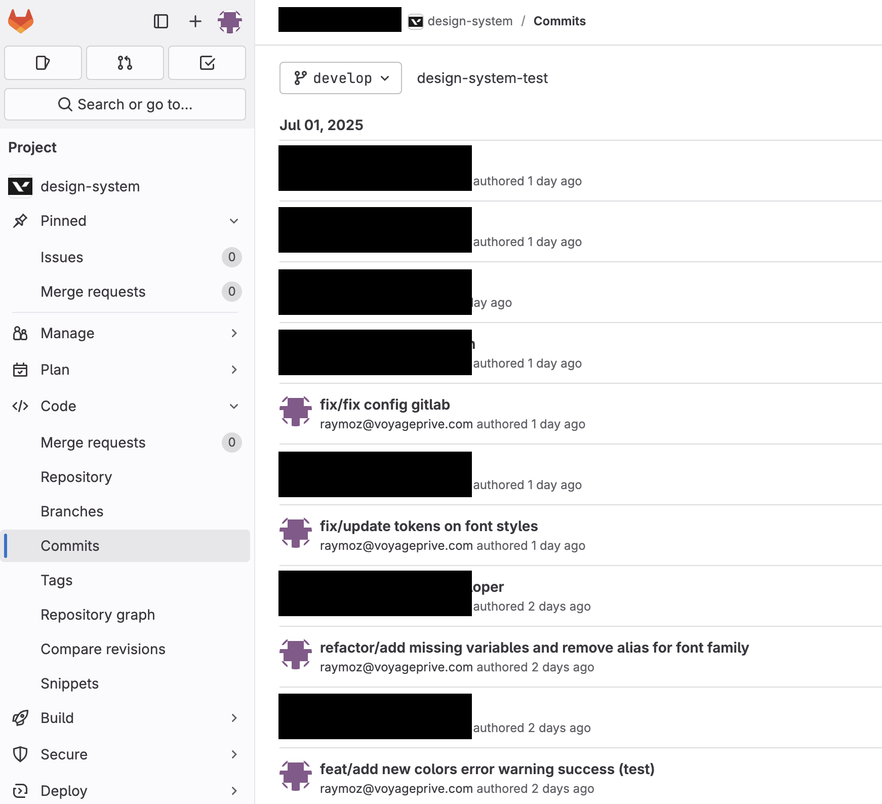
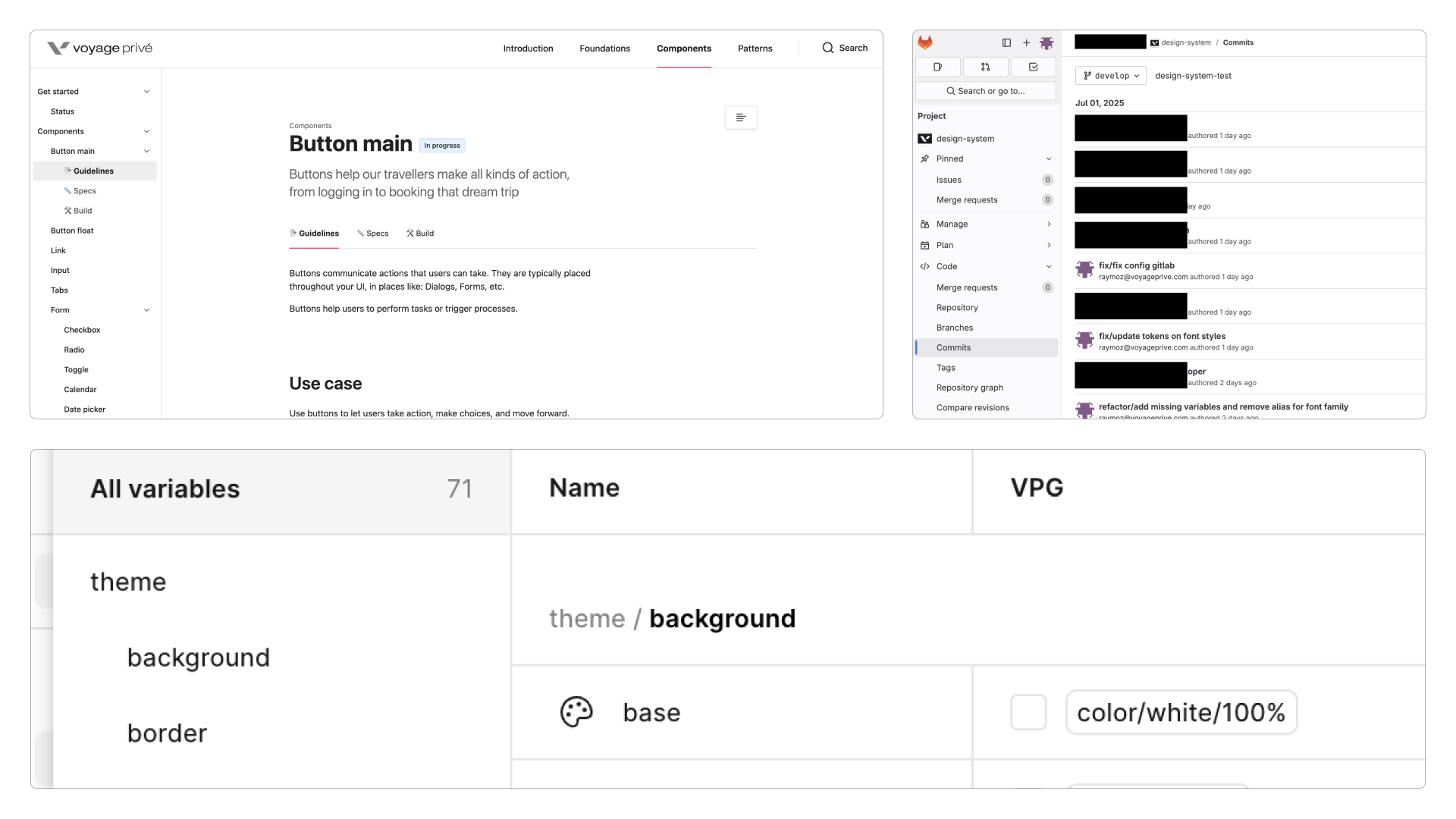
Cutting the cost of every component
Voyage Privé · Product Designer, Design Ops · 2024 – 2025
Context
Voyage Privé had a UI kit. It had grown the way they all grow when nobody owns one: a designer needs a button, the button doesn’t exist yet, a new button appears. Nobody is wrong at any single step.
Do that for long enough and the kit stops saving anyone time. That was roughly the state when I picked it up: a platform serving 44 million members across 8 European countries, held together by components that no longer agreed with each other.
Problem
I went looking for what it was costing. That part was easy to find.
- The same element could show up in 7 different versions depending on which screen you were on
- Delivery ran 28% longer on average, on redundant design work and the implementation problems that came with it (Jira)
- Around 50% of users scored the brand lower on quality, and inconsistent interface elements were the reason they gave (brand research)
- Designers and developers were spending about 30% of their time rebuilding components that already existed
That last one is the number that makes the case. A third of two teams’ time is a headcount.
Objectives
What I set out to hit:
- 90% fewer inconsistencies across every touchpoint
- 60% less time to implement a component
- 40% less time spent deciding, because the decision is already written down
- foundations that hold on web, iOS and newsletters without the brand drifting between them
These were the targets I set going in. The Outcome section says which ones I can actually stand behind.
Discovery & implementation
Audit
I catalogued the whole thing. Over 200 components, 75+ inconsistencies on the journeys that actually carry traffic, and 12 button styles and 8 text input variations live in production at the same time.
Twelve. For a button.
Benchmarking
I read through 15 other design systems, Orange and Skyscanner and Uber among them, mostly for how they sequenced the work rather than what they ended up with. That’s where the prioritization matrix came from: implementation effort on one axis, user impact on the other.
Foundations
Then the unglamorous part, with the developers in the room:
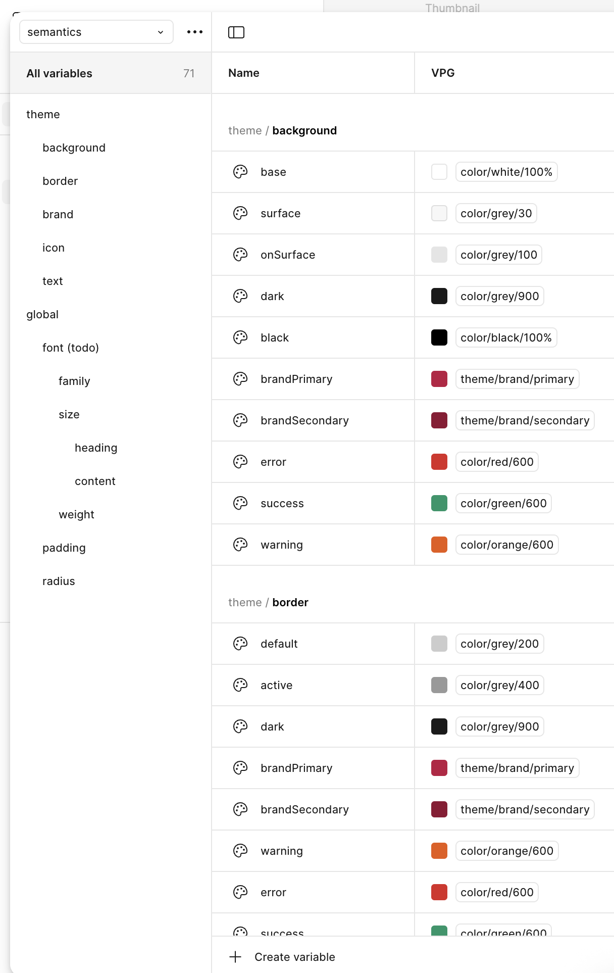
- The palette went from 126 colours to 38 that mean something
- The type scale cut font variations by 65%, and read better for it
- Spacing moved onto an 8-point grid, which retired 20-odd arbitrary values
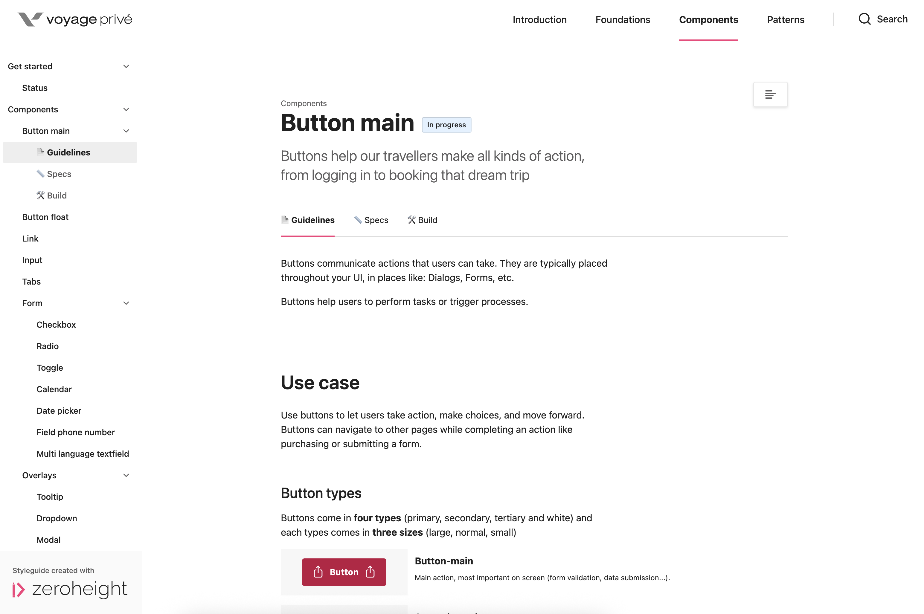
- 35 core components, each one with its states, its variants and its accessibility notes written down
The tradeoff
I pushed for a clean cut. The rebrand was already running — every screen was going to be reopened anyway — so I proposed migrating the 200 components inside that window and deleting the old kit at the end of it. One source of truth from day one, and no period where a designer could reach for the old component and be right to do so.
It didn’t happen. Eight of us contributed across product design and engineering, none of us full time, so the system got built alongside the roadmap instead. A platform serving 44 million members across 8 European countries doesn’t stop shipping. Nobody ever formally turned the migration down; the release train turned it down by never leaving room for it.
So adoption went incremental. New work builds on the system; existing screens migrate when a squad already has a reason to open the file. The matrix set the order.
The cost of that is specific, and I’d rather name it than have someone find it. For most of the fifteen months, two systems were live at once. The old kit stayed reachable, which means the deprecated component stayed a defensible choice for anyone who hadn’t been told otherwise. The 75+ inconsistencies didn’t go to zero — I never recounted them.
What I’d take back is how I argued it. I asked for a quarter of feature work — a cost anyone can refuse. The migration would have ridden on a rebrand that was already reopening the same screens, and I never framed it that way; I pitched a pause instead of a ride‑along. The window closed while we were building next to it. Getting the room is part of the work, and that time I didn’t get it.
Outcome
None of the three were measured. No before-and-after audit ran once the system was live, and reconstructing one now would be inventing the result. The 90%, the 60% and the 40% stayed targets. What I can stand behind is structural, not statistical.
The consolidation itself isn’t in question. Twelve button styles and eight text-input variations became one of each. A hundred and twenty-six colours became thirty-eight. Twenty-odd arbitrary spacing values became one 8-point grid. Thirty-five components carry their states, variants and accessibility notes.
The change I care about more doesn’t have a number on it. The component question stopped being re-argued squad by squad. The default is written down, so the conversation moved from “what should this look like” to “is this case actually an exception”. And because the docs publish from the versioned token source instead of being maintained by hand, nobody has to ask which version is current. That question is exactly what had made the old documentation not worth opening.
What it didn’t fix: adoption still depends on squads choosing to migrate, so the system’s reach follows roadmap luck rather than anyone’s decision. Newsletters were named in the objectives and the pipeline never reached them — the tokens cover web and the mobile app, email was never brought onto them. Two things I’d fix first if I reopened it. Adoption would stop being a squad’s choice and become a condition of the release process. And the system would get visual regression tests — right now nothing stops the drift from coming back quietly, which is how it got there the first time.